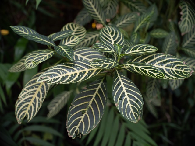
How to characterize the styles and traits of different lenses

Many lenses draw with different characteristics and often have family/brand traits, but it’s sometimes hard to see those differences. Often times the only way to see them is to look at the out of focus rendering. This article will be mostly a place for me to put some images into the same spot and to hold my notes, but I’d love to hear from others who have studied this in more detail or who are also interested.
The main image above was taken with one of my favorite small format lenses for portraits – the older (radioactive glass) Olympus OM Zuiko 55mm f/1.2 lens. Recently I fit this lens to a Fuji GFX-100s camera and was surprised to find that it covered the larger sensor with almost no vignetting. This was a lens which people always seem to favor when I took images of them with multiple lenses. Another one was the Leica 80mm Summilux R. Probably neither of those lenses would be considered to be perfectly corrected lenses, however the beauty maybe in the imperfection?
This Zuiko lens tends to render the lighter regions in an interesting way. These stripes are enlarged in proportion to how far out of the DOF envelop they are. There is a slight hard edge to the outside of the stripe in the bokeh but it’s quite smooth in the inside and partly transparent. The hard edge does not have an outline (dark/light) but rather just an edge. Dark areas and stripes do not appear to be altered in size or shape in the bokeh. Have a look yourself. To help you identify the objects in the scene which are drawn by lens when wide open, I’ll post the same image taken with the lens stopped down to f/11

Here’s some 100% crops of the top middle section of both images:
In the wide open f/1.2 shot zoomed in to 100% you can see how the lighter stripes have increased in width and the further they are from the plane of focus the larger they are. What’s interesting to me is how the stripes going diagonally (the ones down the center of the leaves) are much more pronounced. On the bottom edge there is a outline of light/dark. And in the lower image which is stopped down and less blurred the same things are happening but to a lessor degree. Note that the intersection of the stripes on the leaves are rendered as brighter squares. The dark areas in both images are mostly unaffected however in the wide open image are a bit lighter.


